
We are truly living in the Information Age, with more content than we can ever consume at our fingertips. This abundance means we easily give up on things we don’t see value in. If a website doesn’t give us what we came for in a few seconds or less, we’ll abandon it. Consumers are pickier than ever about how they spend their time, so creators must be flexible and adaptable to stay on the cutting edge of the fiercely competitive attention economy.
The pressure to stay ahead of the game has led to a huge increase in businesses putting out innovative content with arresting visuals, video, audio, web design, and more to reach their audiences. One rapidly growing, yet underused medium that brings the above elements together, is data visualisation.
The power of data visualisation
Data visualisation is the act of conveying information through a series of abstract symbols that utilise variables such as size, colour, position, and texture, to pack an incredible amount of meaning into a small space. This can include conventional bar and line charts, which are best suited for accuracy in formal presentations, or, on the other end of the spectrum, data visualisations can have a completely unique design and user interactivity, animation, and even sound to represent data. Some designs push the boundaries further to create beautiful and abstract pieces of ‘data art’.
Climate scientist Prof. Ed Hawkins understood the power of visualisation to capture attention, engage audiences, and make a lasting impression. When asked to give a speech to a non-scientific audience, he predicted that a conventional chart wouldn’t be very compelling, and would fail to convey his message. Instead, he opted to show a data visualisation that broke almost every rule in the book: it had no title, no numbers, or text of any kind. It simply included a set of vertical stripes, only distinguishable by colour, which represented how the global temperature had changed each year since 1850. This piece is now one of the most infamous and recognisable visualisations ever made, and is featured on news channels and publications around the world.

[Image source: https://showyourstripes.info/s/globe]
Harnessing the potential of data visualisation for exploration and decision-making
Data is a powerful storytelling tool. So, any good data visualisation should start by addressing at least one big question or specific topic. Make sure to identify questions that are of interest to your audience so that the visualisation itself will instantly grab attention and provide meaningful value.
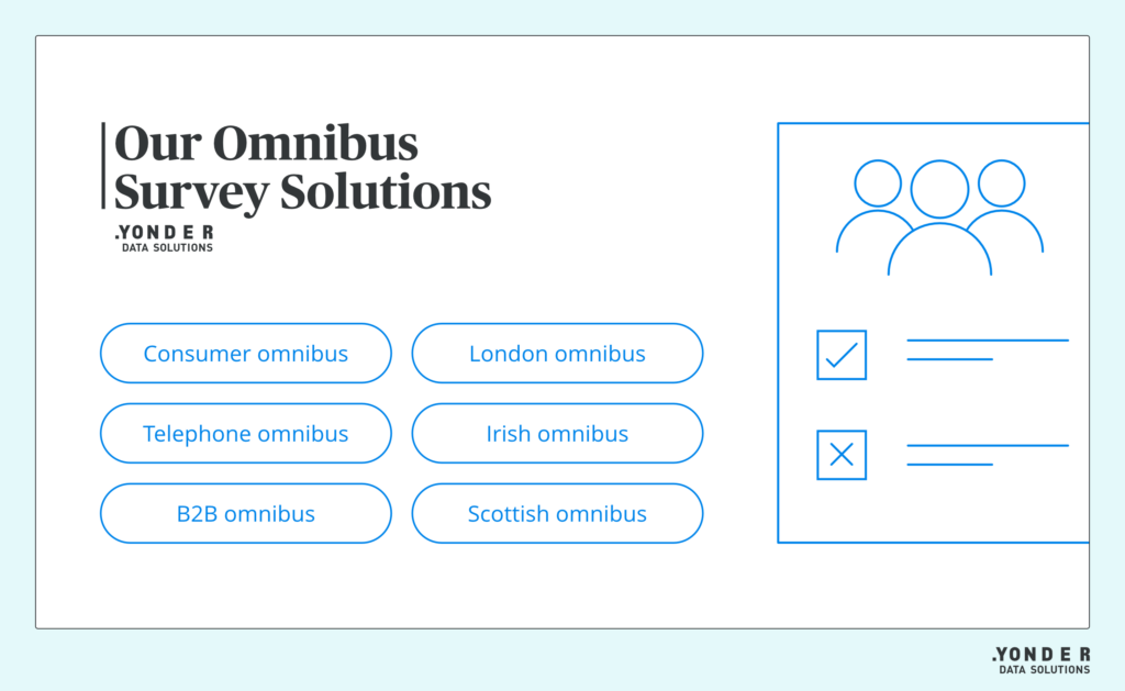
To give you an idea of what this process could look like, here are two examples we built to demonstrate the power and impact of interactive dashboards. Both examples are based on real data from our omnibus surveys, which collect data from a nationally representative sample of over 2,000 people in the UK, across a wide range of demographic data.
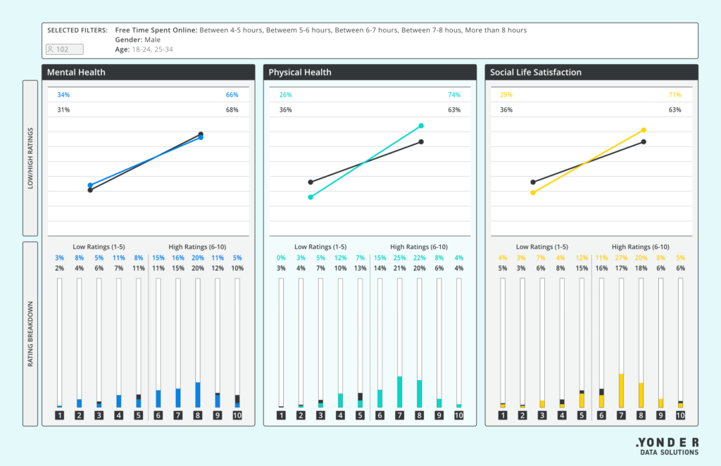
The first example, the Wellbeing Dashboard, looks at the current state of the UK’s mental health and wellbeing. It visualises the results from a two-part survey which collected both quantitative and qualitative data.
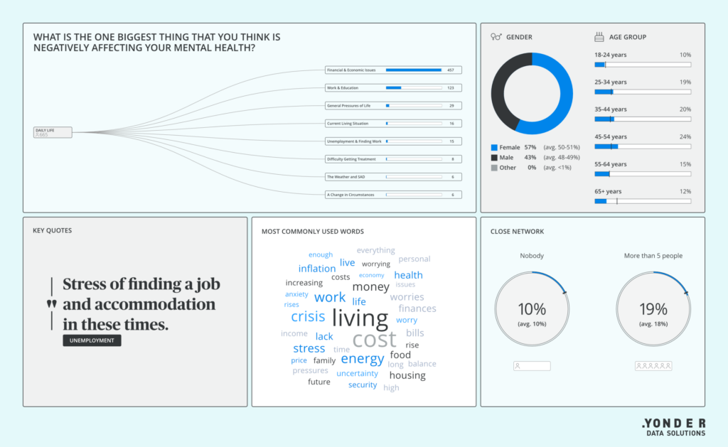
By allowing users to interact with the data, apply filters, and customise views using the ‘Exploration Tool’, the dashboard enables users to dig deeper and uncover meaningful insights they might not have otherwise found in a conventional chart or PowerPoint slide.
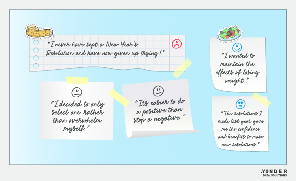
The second example is an interactive infographic on New Year’s resolutions. Here, we wanted to uncover how many people plan to make resolutions in the UK in 2023; what they plan to change, and what might affect their performance.
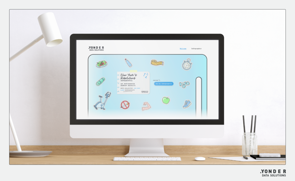
The impact of this visualisation is two-fold – it is both fun and playful, but also informative. Interactive data visualisations can empower audiences to make data-driven decisions. Take a self improvement company – they can derive value from the research visualised in the New Year’s resolutions infographic to inform their strategy by understanding what motivates people to stick to their resolutions.
By leveraging visual appeal, interactivty and genuine, value-adding content, you can engage your audience on a deeper level, fostering trust and turning these audiences into captivated fans, which can ultimately lead to business growth.
Unleashing the impact of data
Thoughtful design can turn rows of data into memorable and sharable pieces of content. To recap, the main advantages of infographics and dashboards include:
- Raising awareness for a particular problem, cause or topic.
- Encouraging your audience to care or take interest in an issue.
- Inspiring people to take action.
- Convincing customers of the value you can bring to their lives.
- Informing your audience about things that matter to them.
Inspiring data visualisations from Yonder Data Solutions
We combine our dashboard offerings with our high-quality fieldwork and data collection solutions to provide a seamless way to bring research results to life and share them across stakeholders.
Want to see more? Head over to our dashboard page where you explore more demos and download our dashboard catalogue.
If you’re interested in finding out how we can assist you with your dashboard requirements, please don’t hesitate to get in touch!