We all constantly make decisions…with some estimates stating that the average adult makes up to 35,000 decisions each day. It then stands to reason that business leaders will have a greater burden of decision-making than the average person, as each decision they make potentially has a cascading effect across their business. Whether this decision-making involves recruitment, strategic planning, or going ahead with that risky, out-of-the-blue rebrand, the key to good decision making is to use relevant, actionable insights revealed from using high-quality data. While it is possible to make great decisions using your own intuition, can you be truly confident that this is a sustainable strategy?
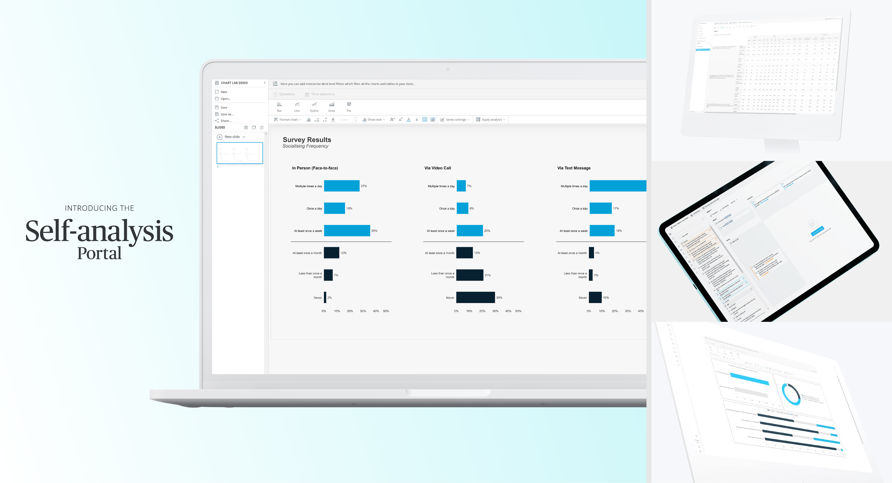
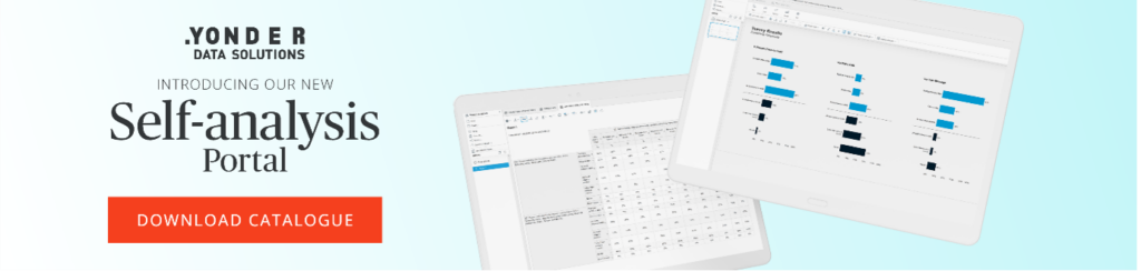
Introducing the Self-analysis Portal by Yonder Data Solutions
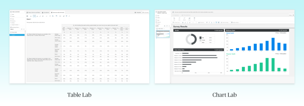
The Table Lab and Chart Lab let you experiment with, combine, and interrogate your research data to your heart’s content. With standard off-the-shelf spreadsheet software, if you want to answer questions about your data, you need to search for it and carefully select the correct columns and rows. This is a time-consuming process at best, with the potential to result in errors, and if you are relying on the insights to make business decisions, could create avoidable financial costs.
Interrogating data in Table Lab is a lot less hassle: you simply select the results you want and fine-tune the output to give as much specificity as you need. You can create a data table with one cell or hundreds in just a couple of clicks. This allows you to quickly iterate tables which is useful in exploratory data analysis. If you need to jump back to Excel, this is not a problem, as you can export tables as an Excel file at any time.

Once you have the lay of the land in Table Lab, you may be thinking about how to get other stakeholders and employees up to speed with your findings. Chart Lab lets you visualise your data using custom charts that you add to presentation decks. You can create presentation decks from scratch or upload your own PowerPoint layout master templates to use. There is a plethora of ways to customise charts and you can even edit data parameters on the fly. With some practice, Chart Lab essentially becomes a convenient data visualisation tool or dashboard builder that you can present straight from the portal or export to PowerPoint or PDF.
To see how to do all of the above and more, download our quick start PDF here and follow along using this demo.

What the Self-analysis Portal means for decision making
By having access to a personalised data analytics platform at all times, you can rapidly transform your data into actionable insights. You’re not always waiting for a data analytics expert to tell you what your data says – you control how your data is analysed and can be sure that your business decisions are based on clear and jargon-free outputs.
The Self-analysis Portal is a powerful data analytics tool because it is built with respondent-level data at its core. This means it excels with data from questionnaires and structured interviews. Every business relies on people to thrive, so gaining reliable data on what real people think is invaluable. Therefore, the Self-analysis Portal’s focus on respondent-level data makes it the ideal tool for understanding your audience and carrying out market research, KPI tracking studies, market segmentation studies, and more.
When you upload your research data, each question is coded as a self-contained variable, meaning that the results for each question can be called and viewed individually. This is especially useful when creating complex multi-variate tables that can answer interesting questions about your data. Once you have a simple table in Table Lab, you can create cross tabulations with other variables. In other words, a simple table will answer the question:
‘How many of my respondents agreed with statement X?’
and a crosstab can answer questions like:
‘What is the gender split on agreement with statement X?’
‘What age groups are most likely to buy product Y?’
‘In what regions of the country is my brand most recognised?
The above ‘what’ questions help you identify problems such as the locations where your brand is underrepresented. You can combine these insights with data from questions that help you solve problems. For example, by asking about people’s opinions and perceptions of your brand or product, you can use the Self-analysis Portal to focus in on the opinions that people have in the regions where you are underrepresented. Or you can double down on stronger locations to do even better. By having access to multi-variate insights such as this, you can explore a multitude of avenues, giving you the power to control your data.
Wondering where to get data that tracks the demographic information of each person responding? Check out our omnibus survey that runs three times a week. You can carry out a nationwide survey with thousands of respondents and have the fully-coded data accessible from your Self-analysis Portal in a matter of days.
Answering questions like the above gives you the foundations to start building a strategy based on your goals. For example, knowing both where in the country your brand is least recognised and the opinions of the people in these places gives you the best chance to make a difference. Combining insights like this allows you to focus on identifying and achieving measurable goals in a way that is informed by your target audience’s needs, desires, and pain points.
Benefits of the Self-analysis Portal
The Self-analysis portal lets you drill down your data to its base components and combine them in any way you see fit. There is no need to manually search your data or spend time copying and pasting table rows. Other benefits include:
- Store and access your dataset in one secure place.
- Study your data at the macro and micro level.
- Generate unlimited tables in seconds.
- Work with multiple data types: respondent-level data, social media listening data, business KPI data, and more.
- Create compelling data visualisations with a powerful chart maker.
- Create slides and decks to present to stakeholders.
- You have complete control over what you create: save, export, and edit as much as you need.
Quick and easy business analytics from Yonder Data Solutions
We combine our dashboard offerings with our high-quality fieldwork and data collection solutions to provide a seamless way to bring research results to life and share them across stakeholders.
Want to see more? Head over to our dashboard page where you explore more demos and download our dashboard catalogue.
If you’re interested in finding out how we can assist you with your dashboard requirements, please don’t hesitate to get in touch!