Obtaining high-quality data is a complex process that involves a lot of people, from survey scripters and data processors, to analytics experts and many more. It’s a significant investment for any business in pursuit of valuable insights from a well-designed study.
After all the hard work involved in producing those data tables, it can be tempting to consider the project ‘complete’ and move on. Data visualisation is often dismissed as a nice-to-have rather than a necessity. Yet while that approach may save time and money, it fails to give your data the attention it deserves and may limit its full potential.
To bring this to life, we are unveiling a new demo that showcases the breadth of our dashboard and data visualisation capabilities. It highlights our ability to craft premium dashboards and visualisations grounded in strategy, precision, and creativity.
*Unless stated otherwise, the data shown in the demos are dummy data.

What is the value of dashboards and data visualisation?
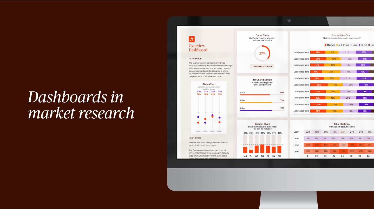
Data visualisation is a powerful way to communicate information, turning complex data into something clearer, more accessible and more meaningful. Dashboards are one of the most effective ways to do this, helping teams quickly understand key information without relying on raw numbers alone.
A well-designed dashboard becomes a valuable tool for evidence-based decision-making. It helps teams engage more easily with data, supports a more data-driven culture and, revealing patterns or insights that might otherwise be missed.
Done well, data visualisation does so much more than present information. It helps organisations understand more quickly and act with greater confidence.
The Yonder way of creating dashboards
At Yonder Data Solutions, we know that no two products are the same. Every client comes to us with different goals, audiences, and challenges, so we believe every dashboard or data visualisation should be created around what matters most to you. That is why we work collaboratively with you at every stage, refining the design to create a solution that uniquely suits your needs.
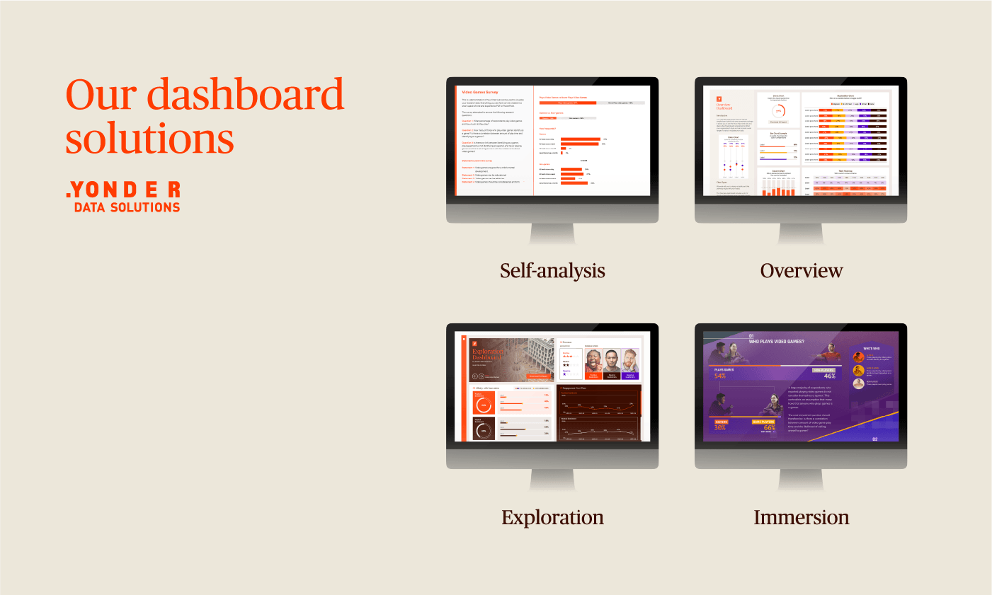
For dashboards, we offer four options depending on the level of design and functionality required:
- Self-analysis: your own data analytics platform for interrogating data and finding answers quickly. It includes Table Lab and Chart Lab, with the option to add the AI Summary Tool for open-ended responses.
- Overview: clear, focused and easy to use, with a more streamlined approach to layout and elaborate design.
- Exploration: a strong all-rounder, offering the flexibility to create an engaging dashboard for everyday use.
- Immersion: a fully bespoke data storytelling experience, designed to be visually striking, memorable and completely unique.
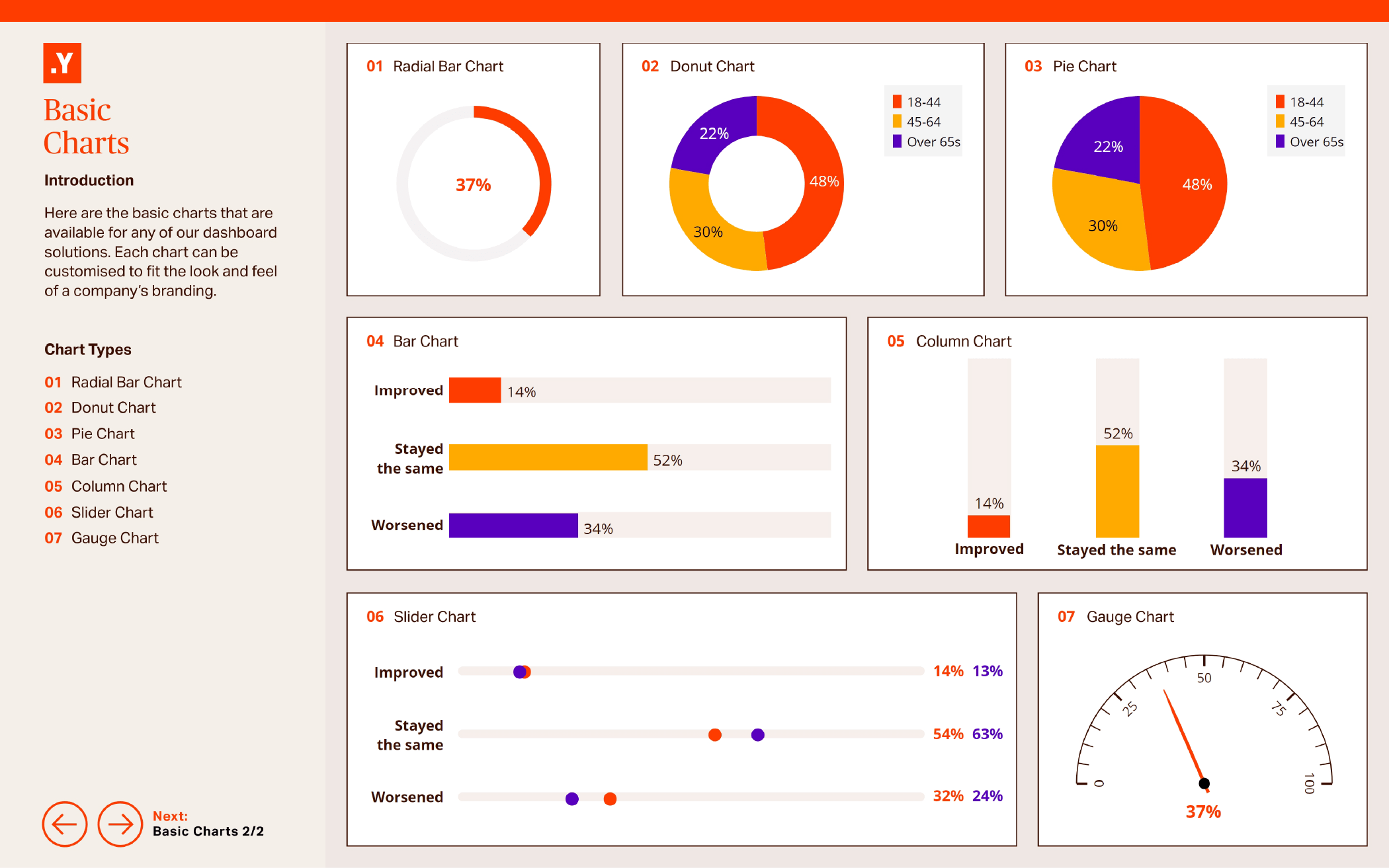
Whichever option you choose, every element is carefully considered. We work with you to select the right metrics, chart types, layout, and design approach to create the most effective solution for your needs.
Too often, dashboards are built with little thought beyond applying brand colours to charts. We take a more considered approach, using strategy and storytelling to maximise the value of everything we create.
Beyond dashboards: other ways to visualise data
Dashboards are only one part of the data visualisation landscape, and they are often designed with internal audiences in mind. But when the goal is to engage customers, investors, or fans, different formats may be more effective:
- Impact reports
- Presentations (e.g. PowerPoint)
- Digital and print infographics
- Social media graphics
- Data storytelling microsites
Whatever the format, we take the same approach to every stage of the design process to create the best possible experience for your audience. In our Dashboards and Data Visualisation Demo, you can explore examples of how we can build not only dashboards, but a wide range of visualisations tailored to different needs.
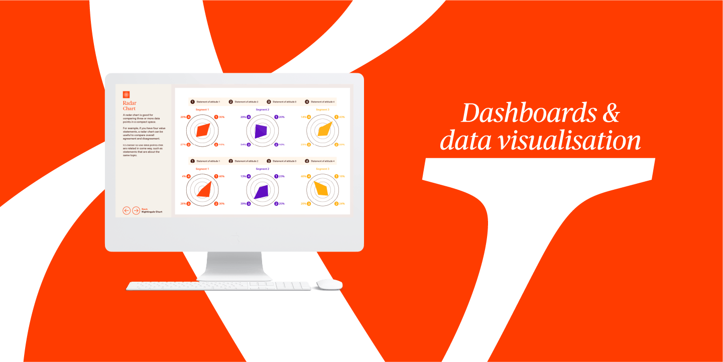
New chart types for dashboards
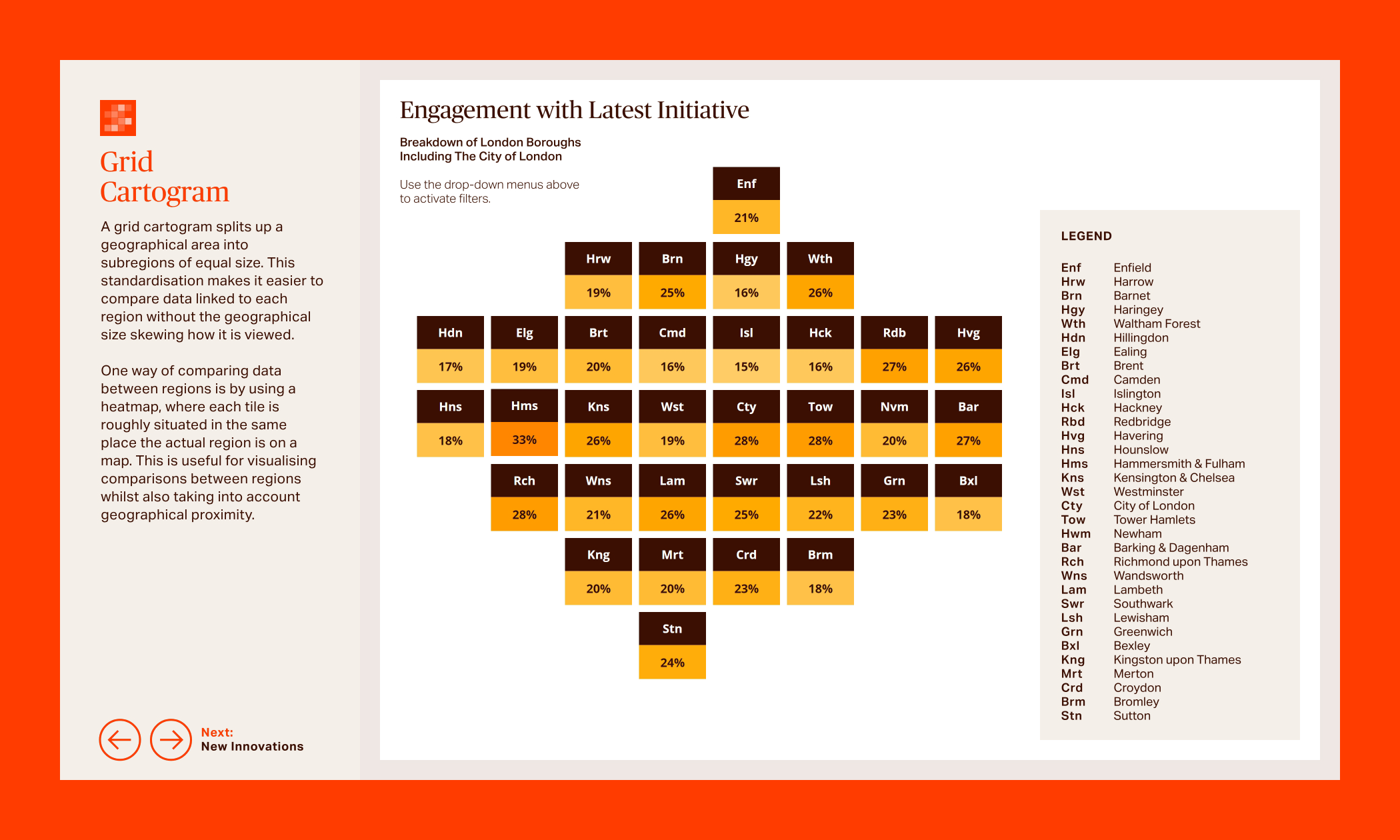
We have expanded our data design toolkit with a range of new chart types, opening up more creative ways to build engaging dashboards and infographics. Each one is designed to help present data in a way that is both visually compelling and easy to understand. You can see these new chart types in action in the New Innovations section of the dashboard demo.
The new chart types available include:
- Radar chart
- Nightingale Rose Chart
- Marimekko chart
- Treemap
- Grid cartogram
AI-powered dashboard tools
Our dashboards can also incorporate AI-powered tools designed to make qualitative data easier to analyse and faster to act on:
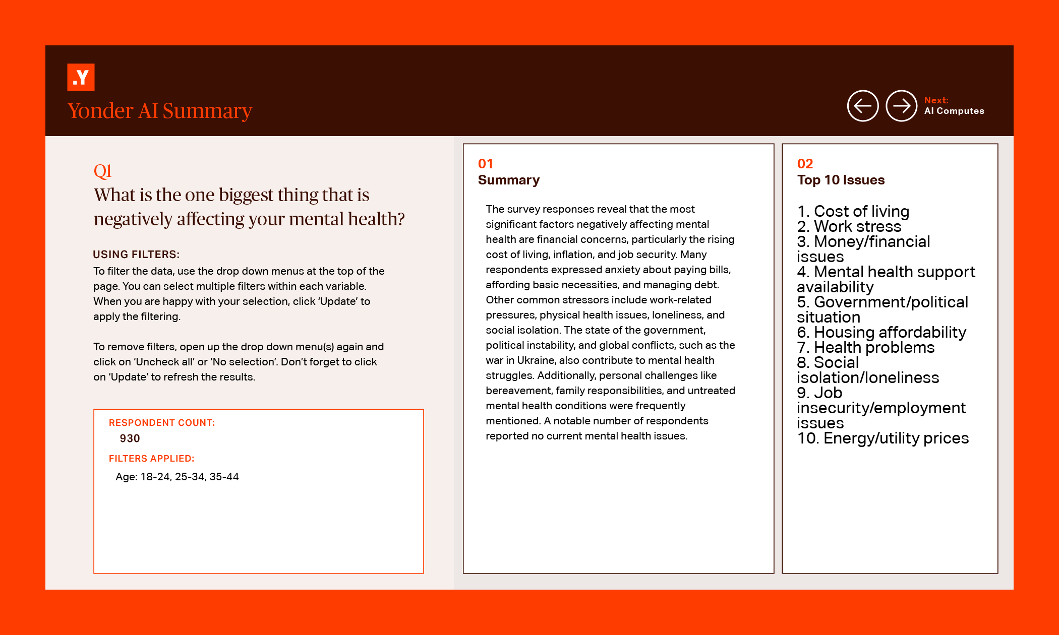
- AI Summary Tool: turns open responses into an instant summary of key findings, with the option to generate ranked lists of the most common themes or issues. It also responds to filters for more specific analysis.
- AI Computes: categorises and quantifies qualitative data, helping you understand how often different themes appear and displaying them through a range of chart types.
As new designs, innovations and AI capabilities are introduced, we will continue to update our demo to reflect the full range of value we can offer.
If you would like more information on how you can enhance your data reporting with dashboards and data visualisation, don’t hesitate to get in touch.
To discuss a project, please contact David Upshall, Dashboard and Data Visualisation Designer.